Selected work / Brand refresh · Identity system · Brand applications
Frontier Senior Living
A new chapter. A recognizable foundation.
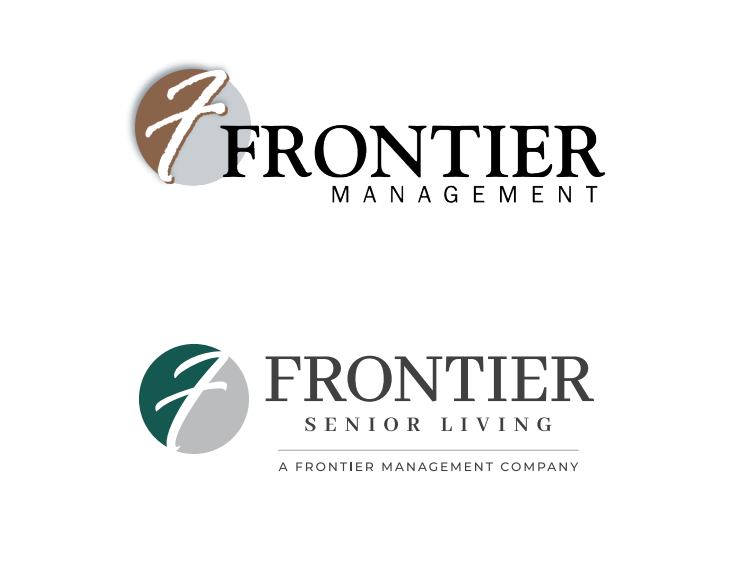
Frontier Senior Living needed a brand that reflected its evolution while retaining the recognition it had built over more than two decades.
We preserved the signature script “F” and refined the typography, proportions and orientation. A hunter-green and gray palette gives the identity a more organized, contemporary presence, with related applications carrying that direction across the business.
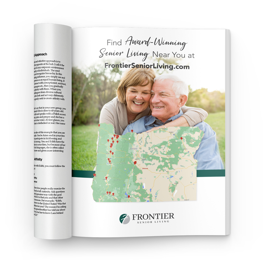
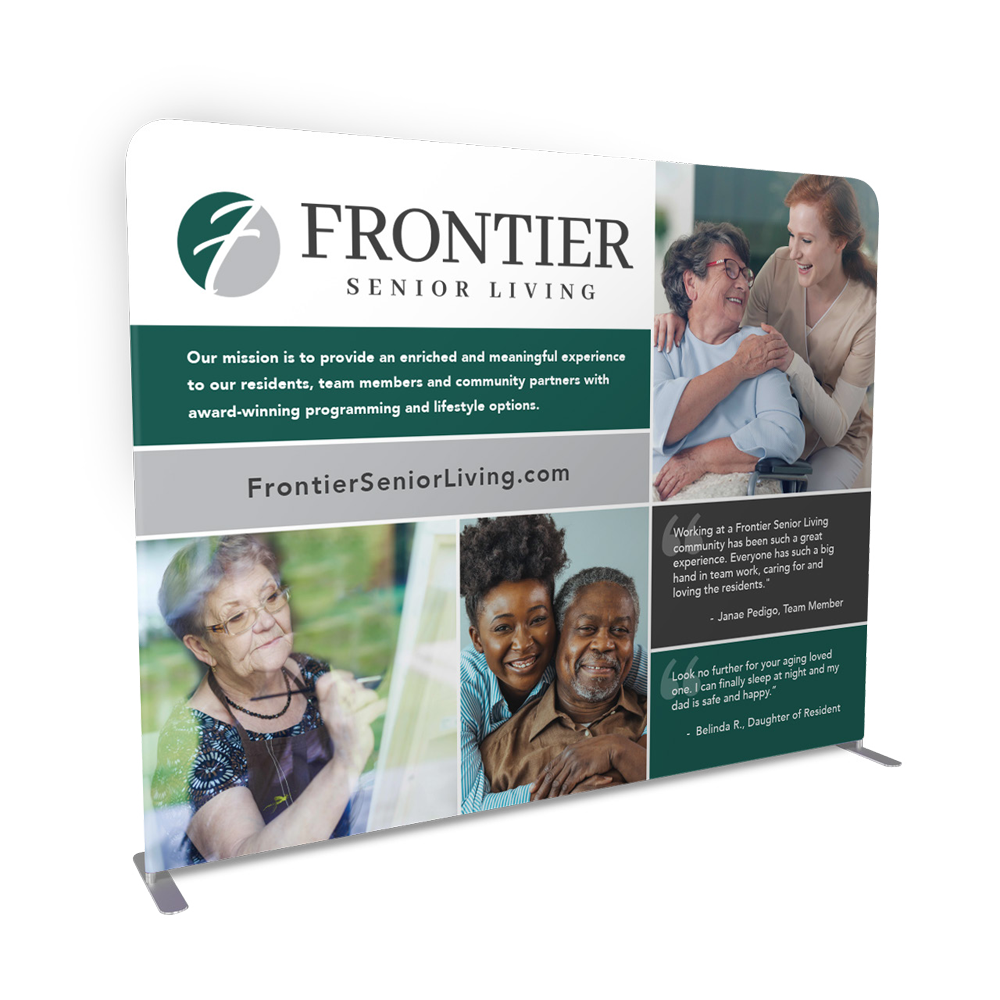
A modular design system brings the refreshed identity to print, digital, apparel and experiential materials. Clear hierarchy and consistent layouts help a large organization speak with one voice.
Internal Programs Alignment
The refresh extends to internal programs, including Spark™ resident engagement and TEAM Rewards. Updated identities and supporting materials connect each program to the wider Frontier brand.