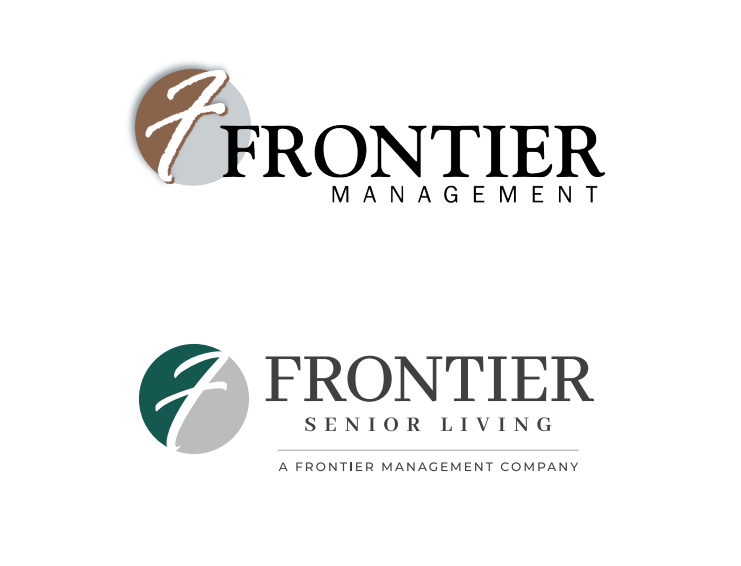
Magnetar partnered with Frontier Senior Living to perform a thoughtful brand refresh, updating the company’s image for a new era of growth and leadership. Originally founded in 2000, Frontier’s brand had remained largely unchanged for over two decades. The refresh was designed to position Frontier as a progressive, modern, and professional major player in the senior living space. We preserved key elements of their brand identity—like the signature script “F” and classic serif font—while refining the logo with a tighter, cleaner, and more defined typeface and a more balanced orientation. The brand colors transitioned from brown, light gray, blue-green, and black to a sophisticated hunter green, dark gray, and medium gray palette, signaling a fresh, organized, and forward-thinking approach. Additionally, Frontier made the choice to change their primary brand in the senior living space to Frontier Senior Living, now a subsidiary of Frontier Management.
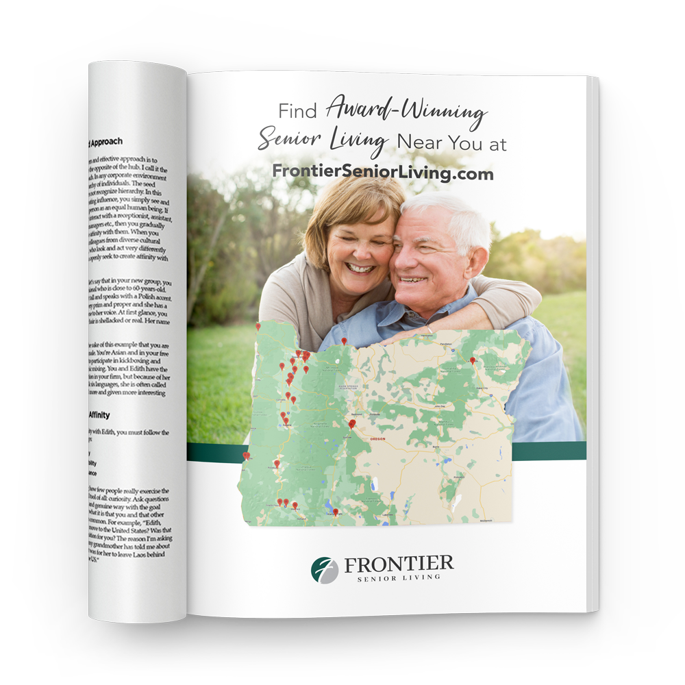
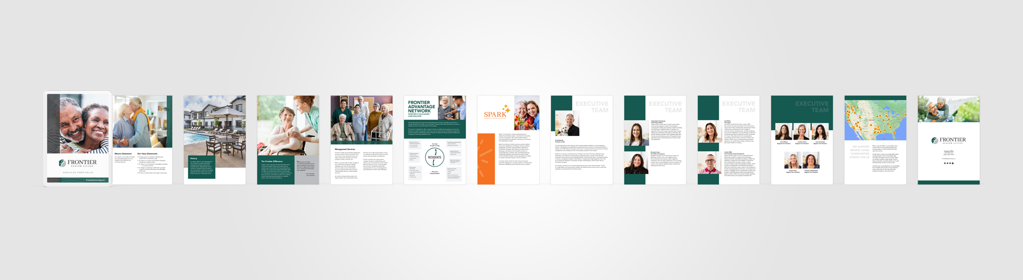
System wide changes were made including experiential, print, digital, apparel, promo and more. Graphical layouts were reimagined to modular formatting, hierarchy-driven, and boldly dynamic, using the new color scheme and other treatments to create visuals that are polished, impactful, and align with Frontier’s new identity.
Internal Programs Alignment
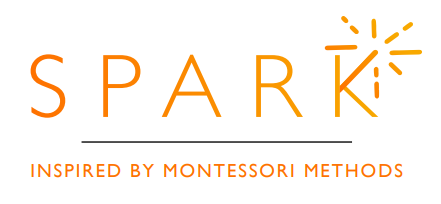
Once the brand refresh for Frontier Senior Living was established, several internal programs were updated by Magnetar. Spark™, a Montessori program designed for resident engagement, and TEAM Rewards, an HR initiative designed for employee acknowledgement, were two such programs addressed. The logos were redesigned and all materials related to these programs were refreshed.